We wanted our new brand to stand for excellence, experience, boldness, and rich history. Here's the story how we arrived at exactly that, and what those funny bars in our logo represent to us.
How Do You Visually Communicate That You Reinvented Yourself?
So, "logIT the web developers" wanted to rebrand to "Logit the B2B digital marketing consultants".
This is what we wanted from our new brand:
- The name "logit" must stay. Everything else can go.
- It needs to be audacious and bold, needs to show character and attitude.
- We're seniors in our industry. Make that obvious.
- It needs to be about us. Who are we? Who do we want to be in the future?
- It needs to be about our work. How do you communicate "we deliver business results"?
- It needs to be about our clients. How do we connect with them through our new brand?
- It should appeal to our target customers.
The Name
We used to call ourselves logIT. (The g is pronounced as in the word green). Small caps l, capitalized I and T.
Because we wanted to simplify, it was decided to write our name in all caps: LOGIT. The typography that was chosen had character and boldness.
Instead of writing our name as logIT, we'll now be known as simply Logit.
The Color
Take a look at our old logo:
![]()
The main color suffers from an identity crisis. Is it green? Is it blue? We don't know either.
We wanted our new brand to be self-confident. Our brand's main color needs to make a statement. It needs to speak loudly. Our old brand is whispering shyly.
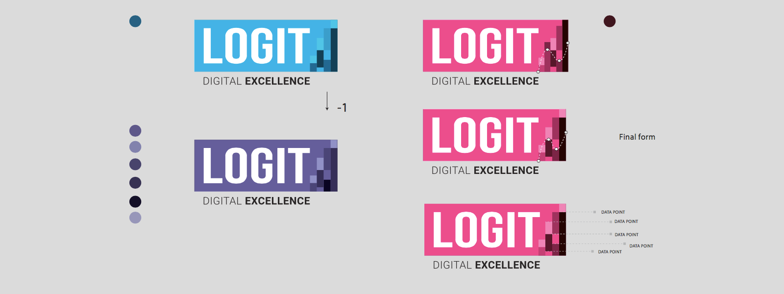
One of the first concepts was this magenta:
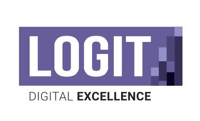
And this purple one:
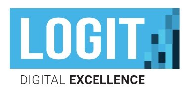
There was also this ice blue concept. We disliked it at first because it was blue: a color we thought we wanted to distance ourselves from:
We almost went with magenta. Magenta had the boldest impact. But magenta wasn't who we were. And it wasn't who our target customers were.
So we reconsidered the ice blue concept. It definitely had boldness, but also just enough formality to suit our goals.
The Motto
We needed something simple and clear, but not too limiting.
We wanted our motto to speak about our core value, what we're delivering, and what we're looking for in ourselves as well as in others (our partners, our clients, our employees).
We chose Digital Excellence. This motto defines our area of work, and the way we work. It guides our decisions. When in doubt, every Logit employee can look at the brand and pose the following question about his or her work:
Is This Excellent?
If it's not, go back and make it so.
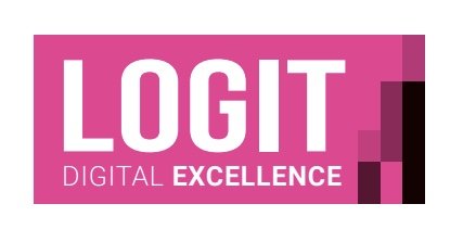
The "Bars"
The bars in our brand are an abstraction of a several stories all at once.
The Way We Work.
We make decisions based on data, not opinions.
The bars in this context represent the data part of our business. When we consult our clients, we put aside our feelings and any HiPPOs (highest paid person's opinions). We look at what the data in our analytical tools is telling us. We look at the reality.
In order to always stay true to making decisions based on data, we decided to make data part of our new brand.
We could have chosen another fine metaphor. For example, we received the following as one of the early concepts:
We called this concept "the excellence is in our DNA". We could have developed this concept further, but you could only tell one story with this concept. The bars concept allowed us to tell several stories, including our clients' stories.
What We Deliver.
We're in the business of delivering business results. In a way, what we deliver can be visually represented as a bar chart. We expect our work to be evaluated based on analytical tools. We expect some of our clients to speak the language of Google Analytics. When they look at their business online, what they see are bars. Logit has the power to change those bars.
The Reality of Digital Marketing.
A bar chart going a little up and then a little down represents the reality of digital marketing on a daily basis. Every marketer knows how it feels: the elation of conversion ratios going up and the depression of conversion ratios going down. We wanted our new brand to remind us and our clients to never lose determination in digital marketing when the numbers are going down. Also, we wanted to stay humble when the numbers are going up.
The Reality of Our Clients' Businesses.
Every business has its ups and downs. There's a curve hidden in our new brand, and it looks like this:
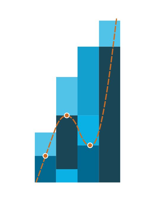
See how deeply the curve sinks in act three?
See how boldly the curve rises in act four?
No matter which act your business is currently in, we wanted our new brand to inspire our clients to never give up.
If your business is growing, don't neglect it: keep investing in it. Digital marketing is always a good investment for a B2B company.
If your business is in downward spiral, act: digital marketing can help you rise.
Our Past.
The "bars" concept of our new brand made us "see what we wanted to see" in it: our rich 15-year history. We developed as a company in "four acts". This website is the fourth version of our website. There are four bars in our logo, and the curve symbolizes our history:
We grew through acts one and two, experienced a crisis in act three, and rose again to become ready for act four. We wanted to never forget the lessons we learned on our journey. Our new brand makes sure we never will.
Our Future.
We're now at the beginning of act four. We don't know what the future brings. All we know is that we're ready and excited about the value we can create for our clients who will join our journey. We're ready for every new act to be a little like the whole journey: there will be ups and there will be downs. And ups again :)
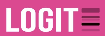
Here's the final Logit logo:
![]()
But the real brand is how you see us. Join us!